Architecting a Design System
Over the course of 2 years, I took on the role of a Design System Architect to create an accessible and consistent customer experience for all users and streamline adoption of accessibility by the development team.
Duration: 2 months | Role: UX Architect | Team: Platform Team
What prompted the Design System push?
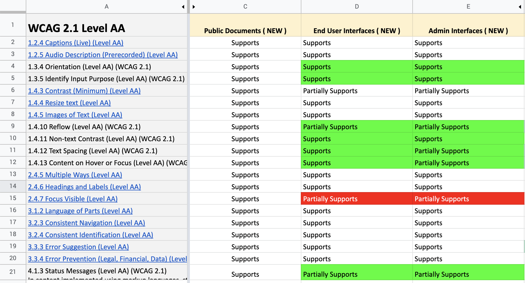
An external audit identified a series of compliance failures across a public-facing product with high liability. We needed to quickly understand the results of the audit, present a path for resolution and educate our teams on how to solve accessibility issues. Along with that, the document management software that allows organizations to manage their content life cycle was suffering from performance issues, functionality issues, and outdated UI which was hampering its usability and growth.
The Challenge
The challenge here was to create a design system that was simple, accessible, and scalable for both our developers and customers.
Current Experience
The product was a web app consisting of 100s of screens, managed by separate product teams that shipped bi-monthly. The user experience was inconsistent, bogged down by accessibility problems. New customers found it difficult to onboard.
Vision
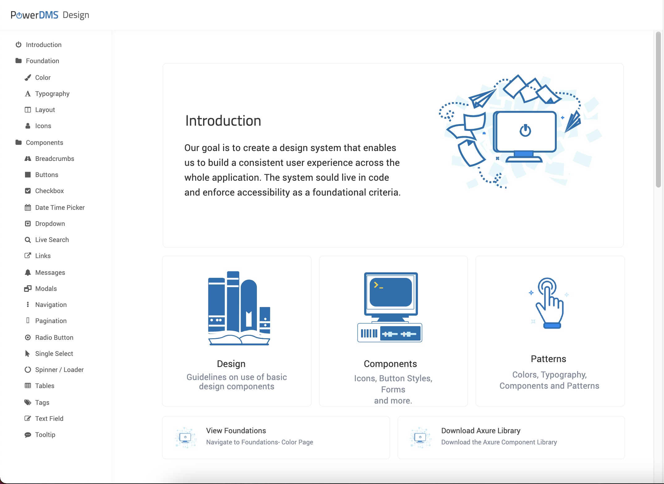
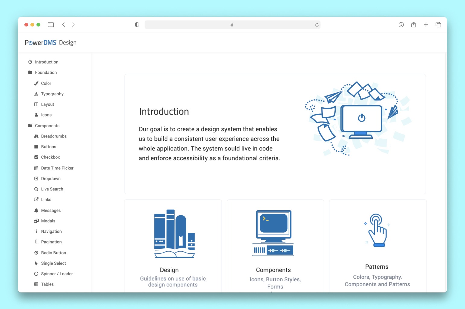
The vision was to create a homegrown design system with principles, foundational guidelines, components, and patterns that was implemented in code.
Goals
Improve Product Aesthetic
We wanted to improve the product so it looked Modern and design each individual component to allow for a more familiar and good looking aesthetic.
Make it Accessible
Along with aesthetics, we wanted to make it more accessible for all our users and ensure we are not legally liable for lack of accessibility.
Discovery
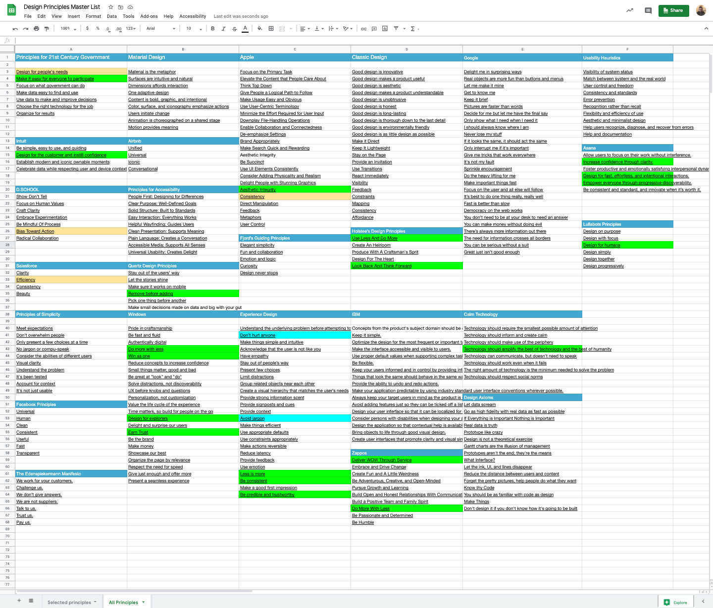
In my research with product teams, I found that each of them followed a different process, however, everyone wanted to execute more quickly. My literature review of existing design systems literature placed high emphasis on creating a shared understanding of the goals of the system. To create a shared understanding we needed some core principles of design at the organization.
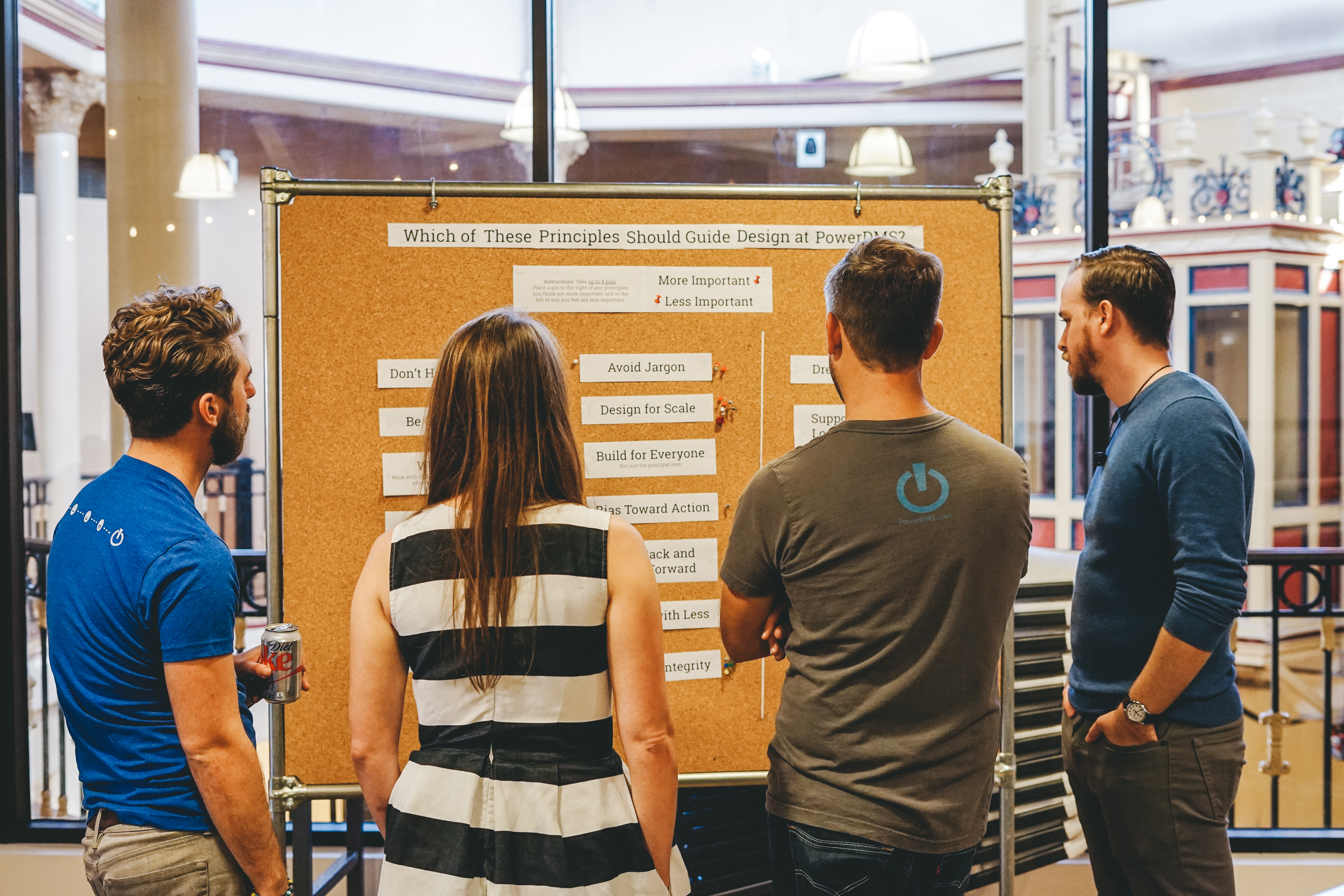
Starting from scratch
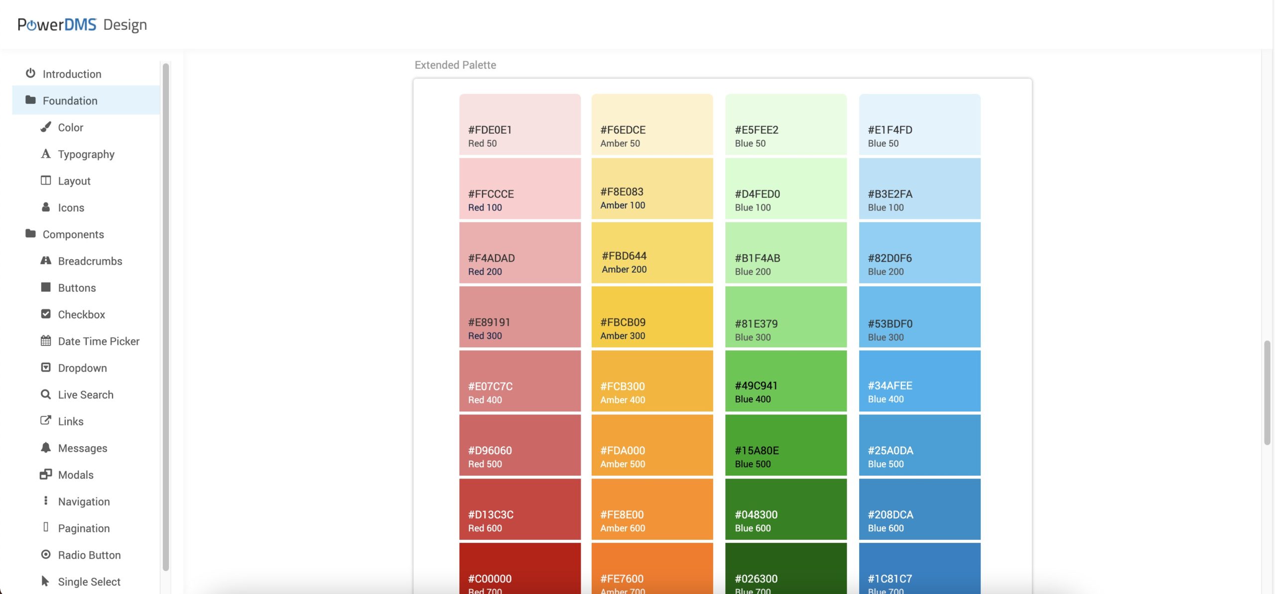
As a new design system, we needed to build all aspects of the product, including typography, grid, color profiles, and more.
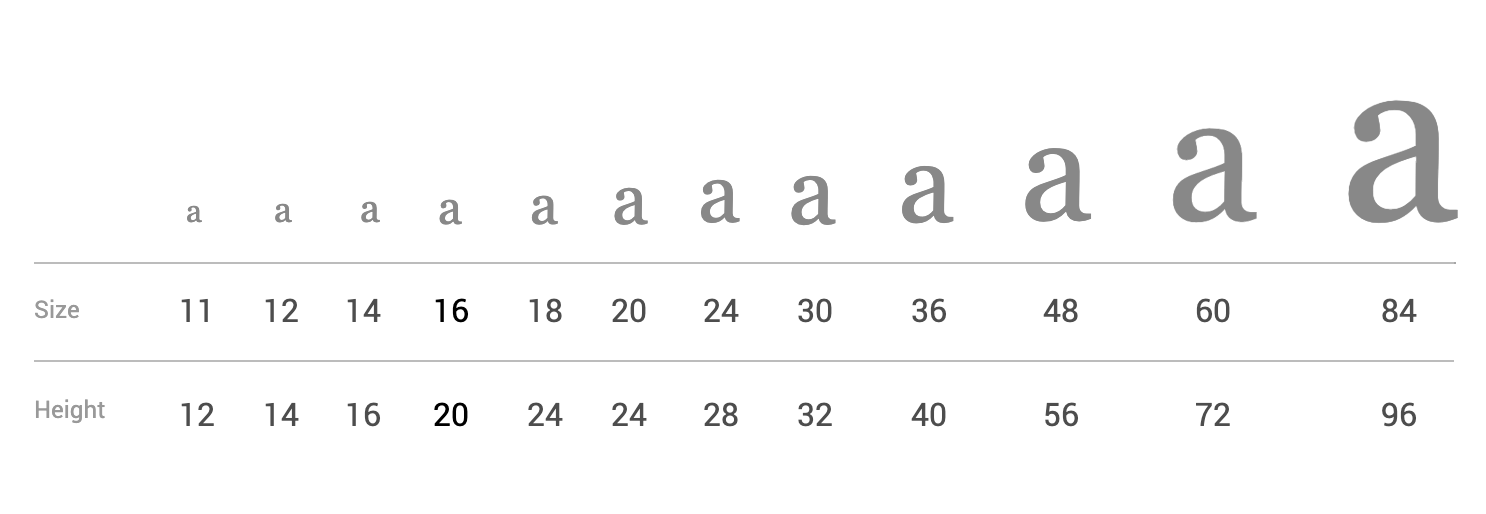
Typography
We had to formalize our color and typographic scales. While Matt, my lead, focused on establishing our color palette, I set out to outline our typographic scale. We were already on a base font of 14px. I picked the Minor Second scale as it has the most variations at the smaller intervals (10-20px) and fewer variations at larger intervals(20-40px).
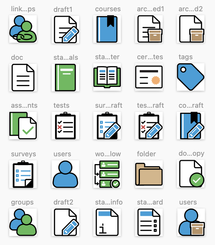
Creating Simpler Icons
I also designed new icons from scratch that followed the core set of design guidelines established as part of the grid and layout. We need to accommodate a variety of icon styles such as:
- Mono color
- Full color
- Icon button
Along with icon styles, we also created size variations that scaled across device types.
- xx-small
- x-small
- regular
- x-large
- xx-large
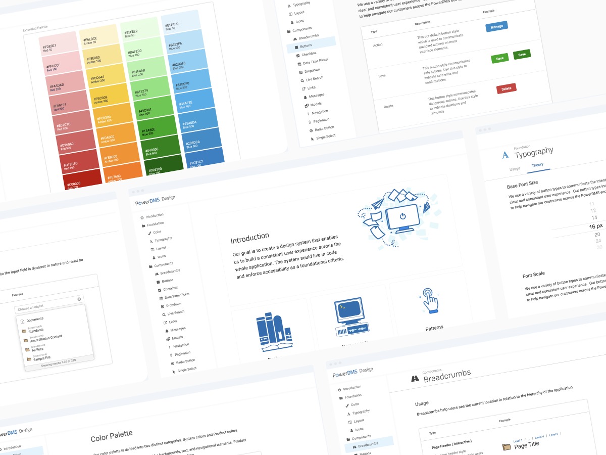
Implementation
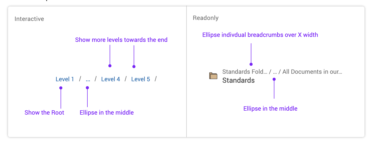
We knew that molecular components in the style of atomic design are more scalable and adaptable. In order to build them, I started by auditing the app and creating an Interface Inventory. Here are some examples of individual components that were unique to the organization that I redesigned from scratch.
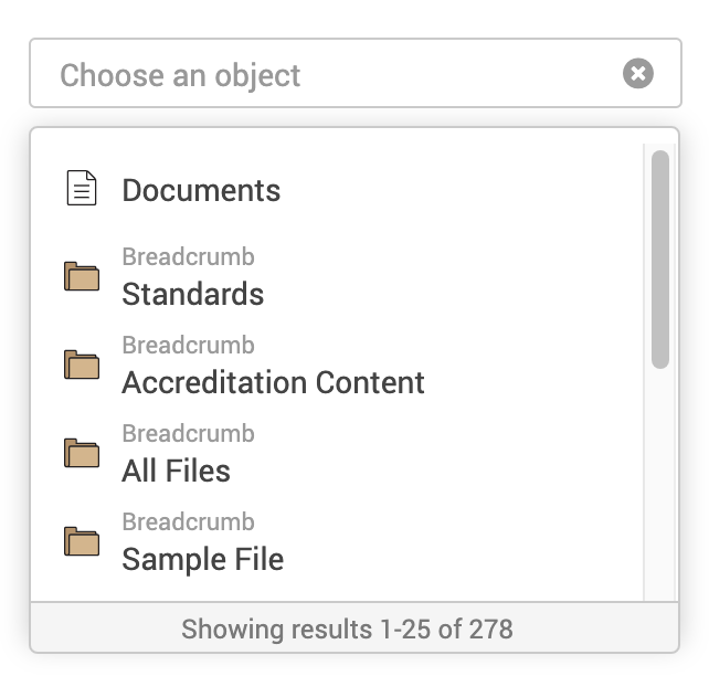
Live Search Component
The Live Search Component allows the selection of an object such as documents, Folders, Users, Groups, Courses, and more.
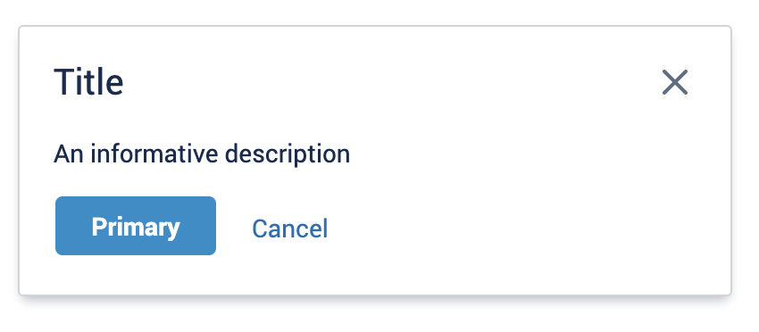
Modal/Dialog Component
The Modal/Dialog Component is used as a prompt to confirm actions, provide transition screens and deter destructive events. Modals should be used sparingly and only when necessary.
.
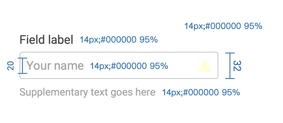
Design system specifications
Along with the interaction design, I also provided visual specs for the development of these components into the global design system.
Outcomes
We knew it wasn't a real design system unless it lived in code. The front-end lead had prior experience working with Storybook and we started with implementing our foundational color scale and incorporating that into the Buttons and Message Box components.
Results
Today, we have 14 out of 30 different components in code with several being foundational elements such as the grid, color scale, typography, and accessibility guidelines.
Customer Impact
Our foundational elements were Typography, color, voice, and tone along with layout and general aesthetic. By embedding accessibility in each of these foundational components, we were able to ensure it remains a core part of the future design process and helps all customers moving forward.