Redesigning Analytics and Reporting
Over the course of six months, I helped design a new reporting platform to provide better ways for our customers to understand data and get insights on task completion, organizational compliance, and risk management
Duration: 6 months | Role: Lead Product Designer | Team: Data Team
Why redesign Reporting?
"Reports" was originally designed to provide customers with access to their raw data. It was built for approximately 500 customers and ~500K users. As the product grew to double the original size in both customers and users, it was no longer an effective solution for our customers and users routinely reported a lack of data points, incorrect report names, and long loading times when interacting with the existing solution
The Challenge
The challenge for us was to design a new reporting platform that provided flexibility, table stakes features such as delivery, and easily digestible insights in a modern user interface. We wanted to provide better ways for our customers to understand data and get insights on task completion, organizational compliance, and risk management.
Current Experience
Reports stored decades' worth of data in the system but our customers found it hard to navigate and adoption had stalled over time. We discovered several problems with customer interviews, problems such as misleading reports and filter names, lack of much-needed features, intermittent performance issues, and clunky user experience.
Usability Issues
We discovered several problems using customer interviews, problems such as misleading reports and filter names, lack of much-needed features and a clunky user experience.
Performance Issues
Reports also suffered from a host of intermittent performance issues such as slow loading or failure to load. This led to reduced adoption overtime.
Vision
The vision was to design and implement a new account creation and onboarding experience that can facilitate multiple types of customers and provide bulk experiences for uploading users and content.
Goals
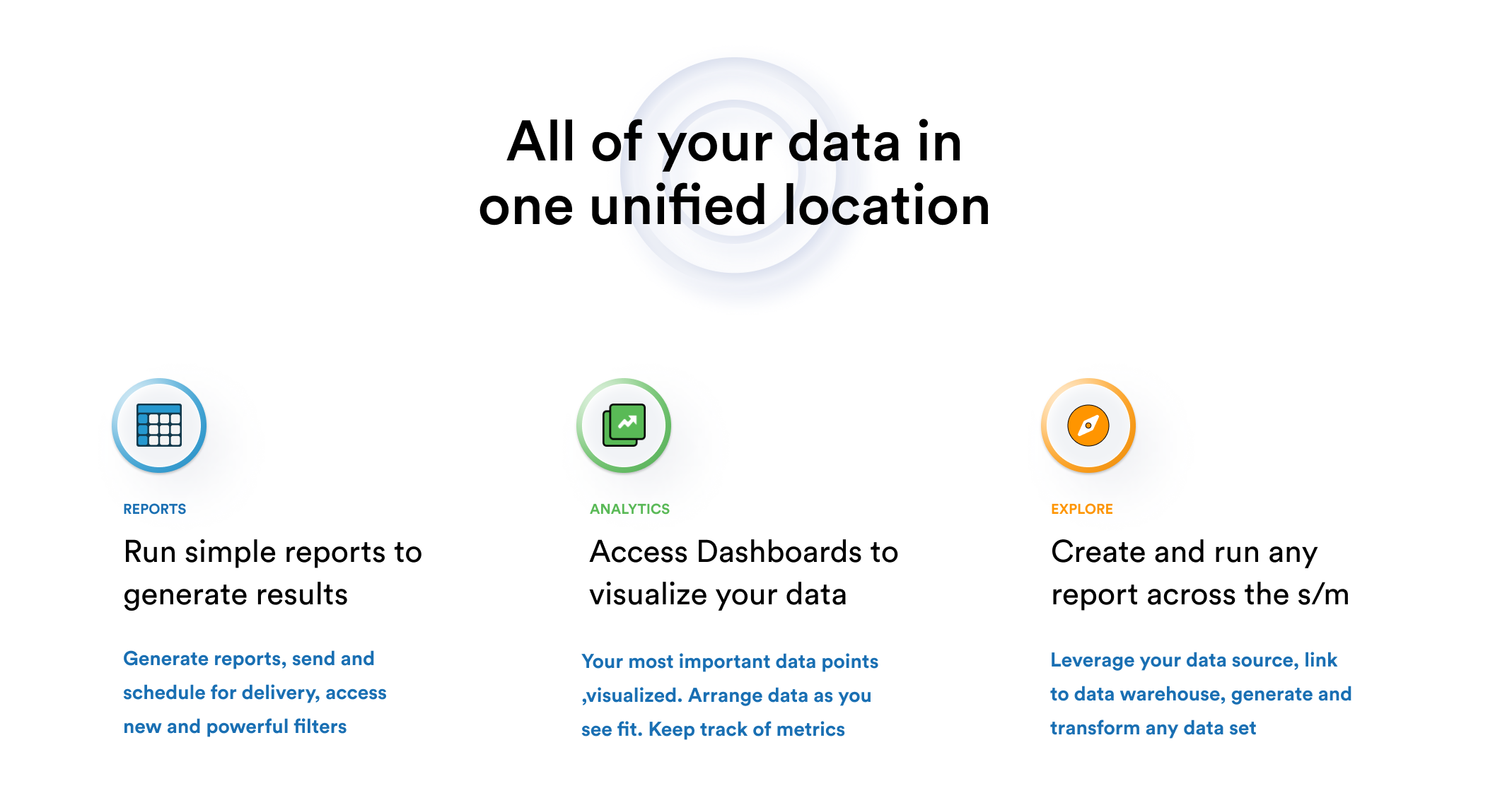
Deliver New Features
We wanted to implement several net-new features that provided users with better ways to manage their reporting needs.
Access to Key Insights
We also wanted to provide data visualizations that could give insight into the most important metrics our customers cared about.
User Research Methodology
Our initial research was done via customer surveys and 1-1 exploratory interviews. The findings informed our approach to concept and product design, along with pricing, segmentation, and customer adoption projections.
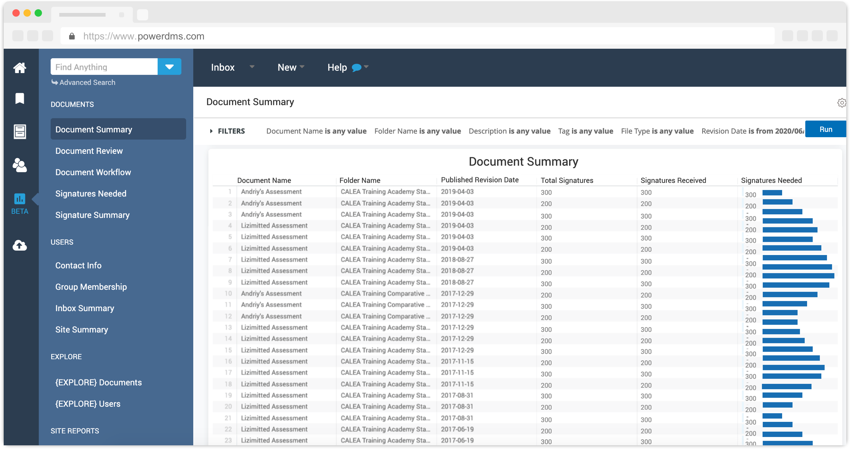
Wireframes
To generate concepts and ideas and get consensus from key stakeholders, I prototyped key ways users would access reporting and functionality that would provide benefits.
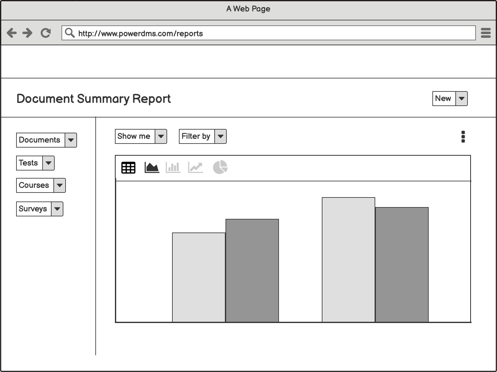
Explorations and Improvements
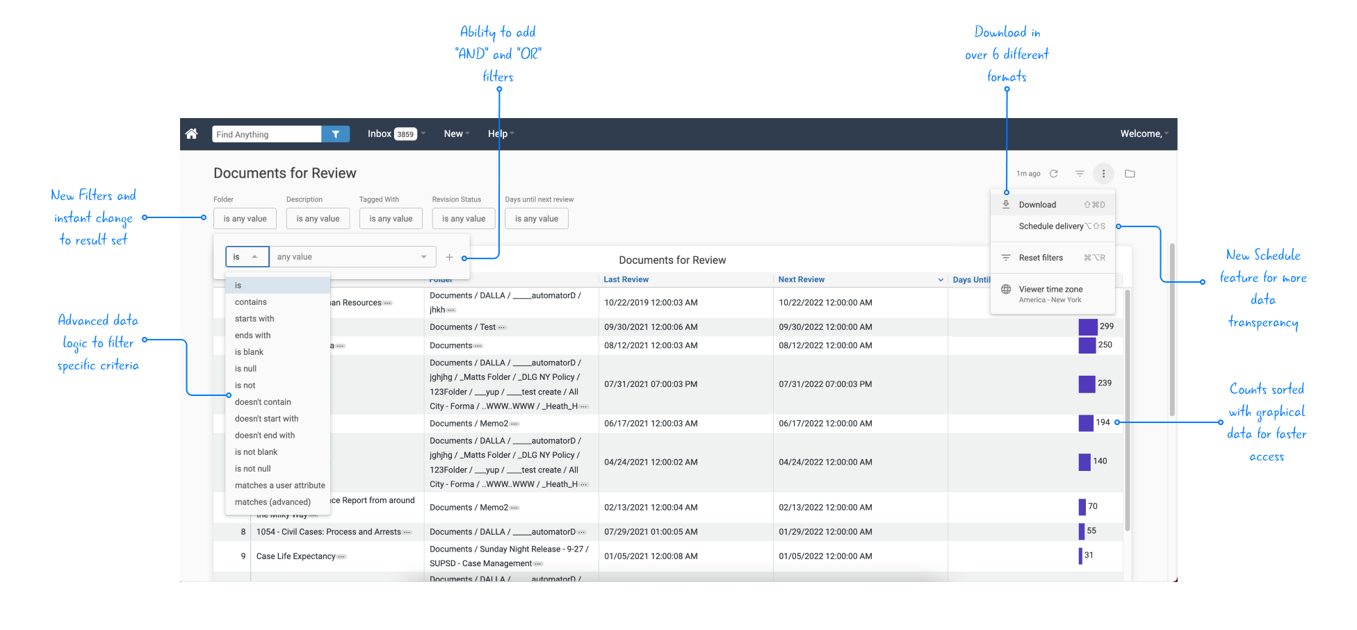
I explored several different alternatives to both visualizations and tabular reports. One key insight from customer testing was incorporating bars in Tabular charts to provide context and value guidance.
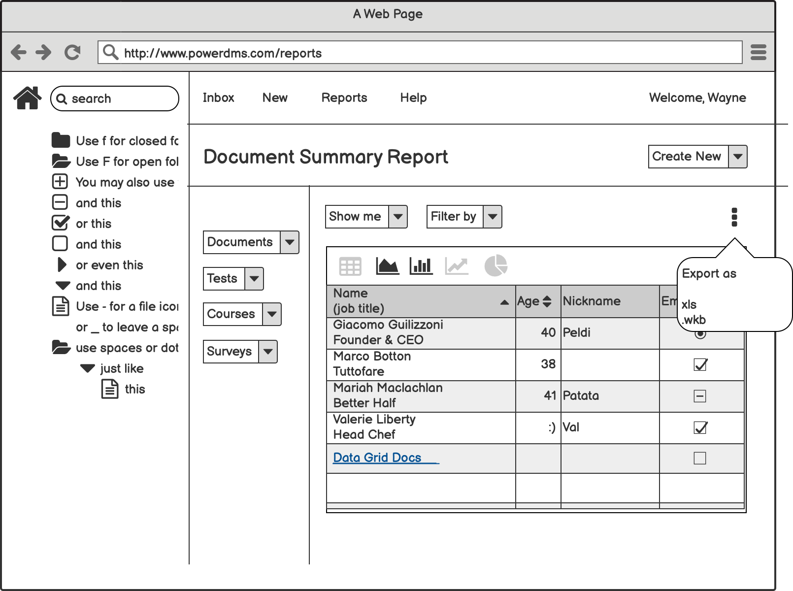
Delivering New Features
To solve the common complaint where filters must be selected before running the report, we added filters inside the report window along with additional logic parameters ( AND | OR) for more robust filtering.
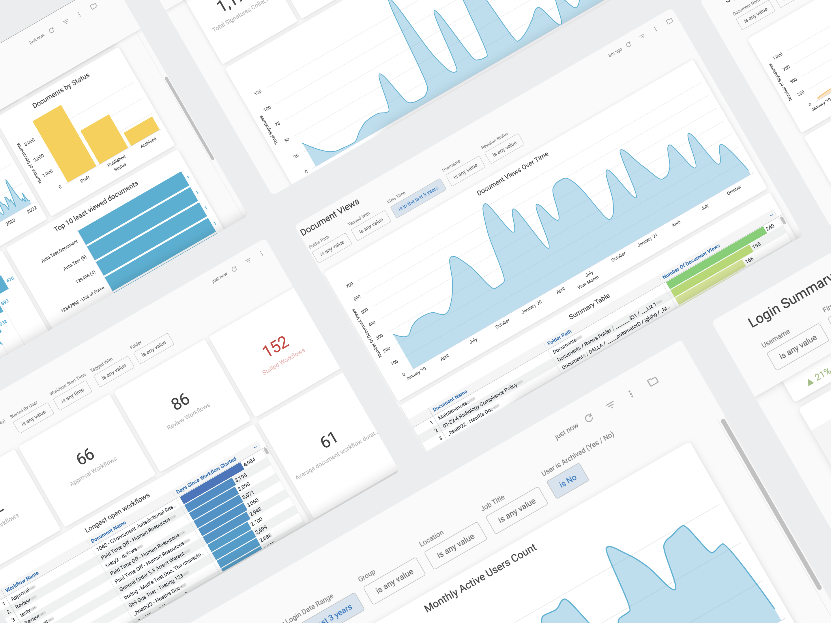
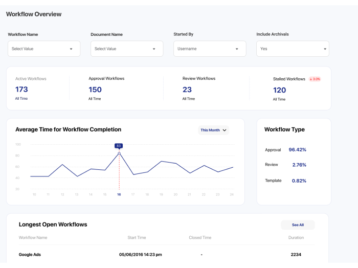
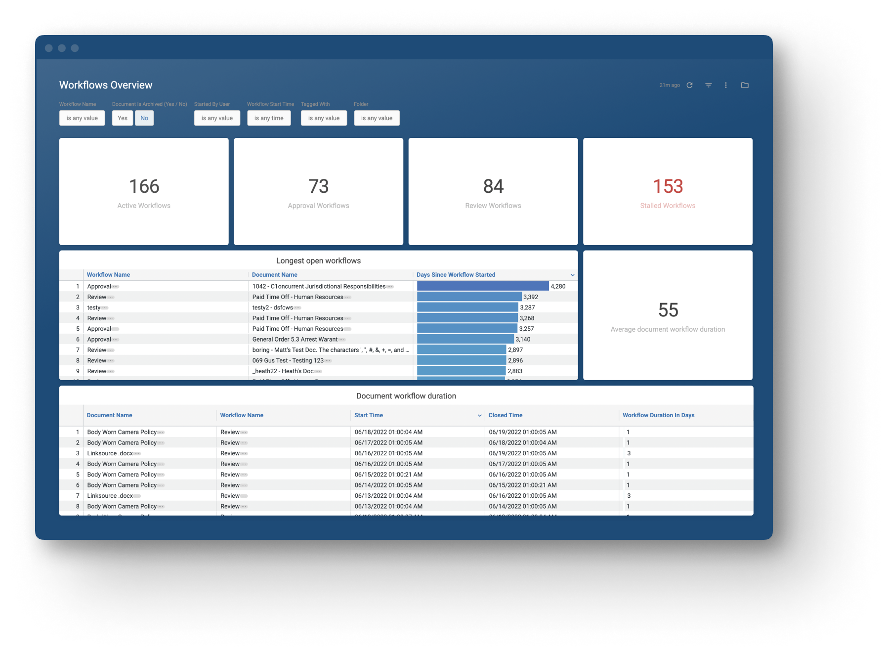
Stalled Workflows
One common customer problem was that their workflows took too long to complete and they had no visibility as to how many were stalled and who was holding them up.
By visualizing key workflow-related metrics and providing a drill-down for deeper analysis, we were able to help fill gaps in their processes.
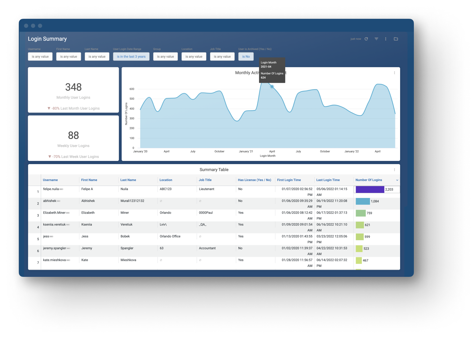
Logins
Another common problem was understanding how often users were logging into the platform and viewing policies. Login Summary allowed administrators to gain access to new insights on their employee usage and make shifts accordingly.
Icon Design
To build a cohesive brand experience, I designed new icons that communicate the key difference between a report, a dashboard and the explore product. I ran A/B tests to identify several variations of the core design objective before applying the final assets in application and marketing content.


User Testing and Validation
I was able to test different explorations over a 1-month period with ~13-14 customers. Testing followed a multi-round beta study where users were asked survey questions periodically to validate customer experiences.
Key Highlight
- The redesign opened up a new market segment and improved usage for 4000+ customers and 200k administrators.
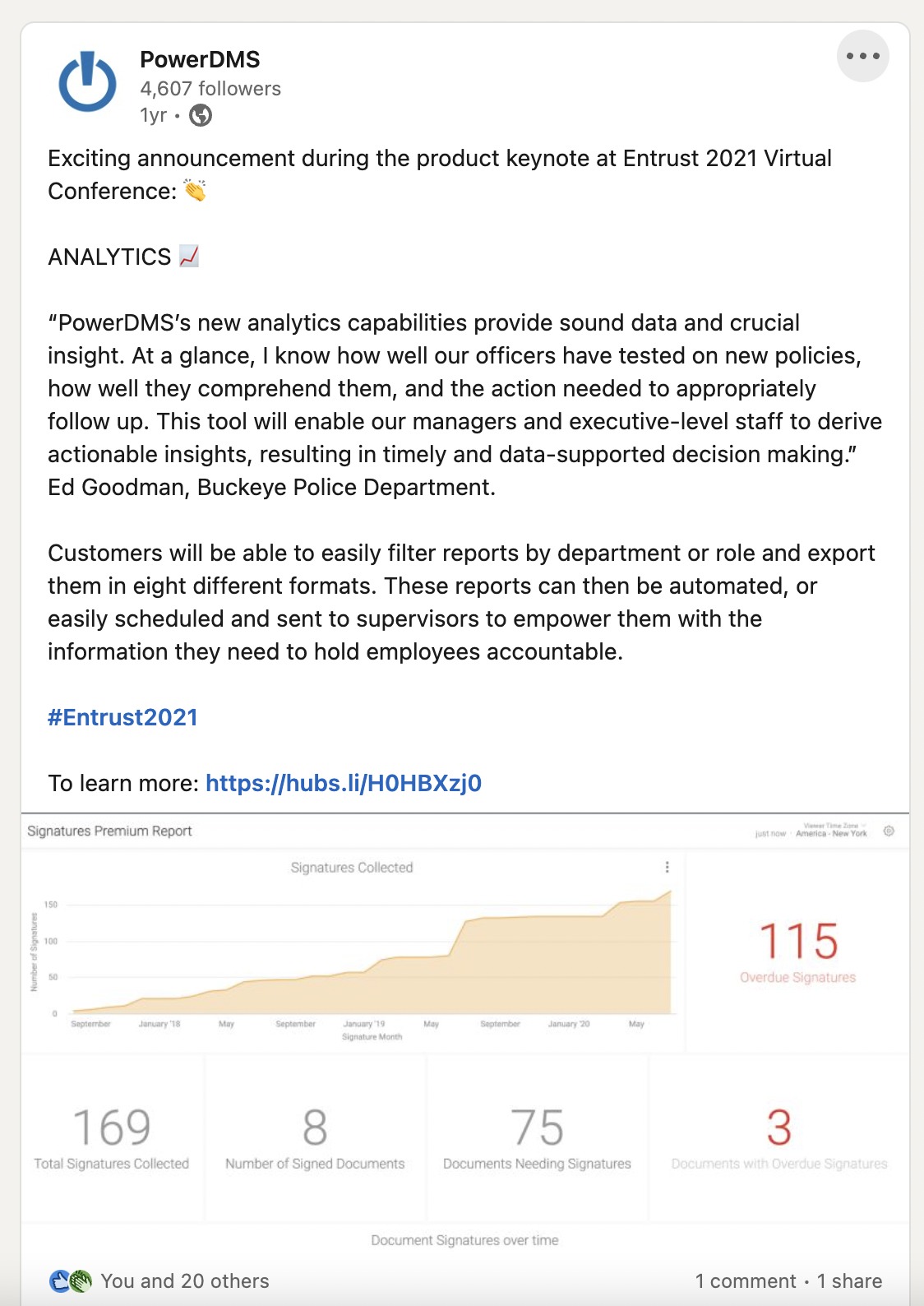
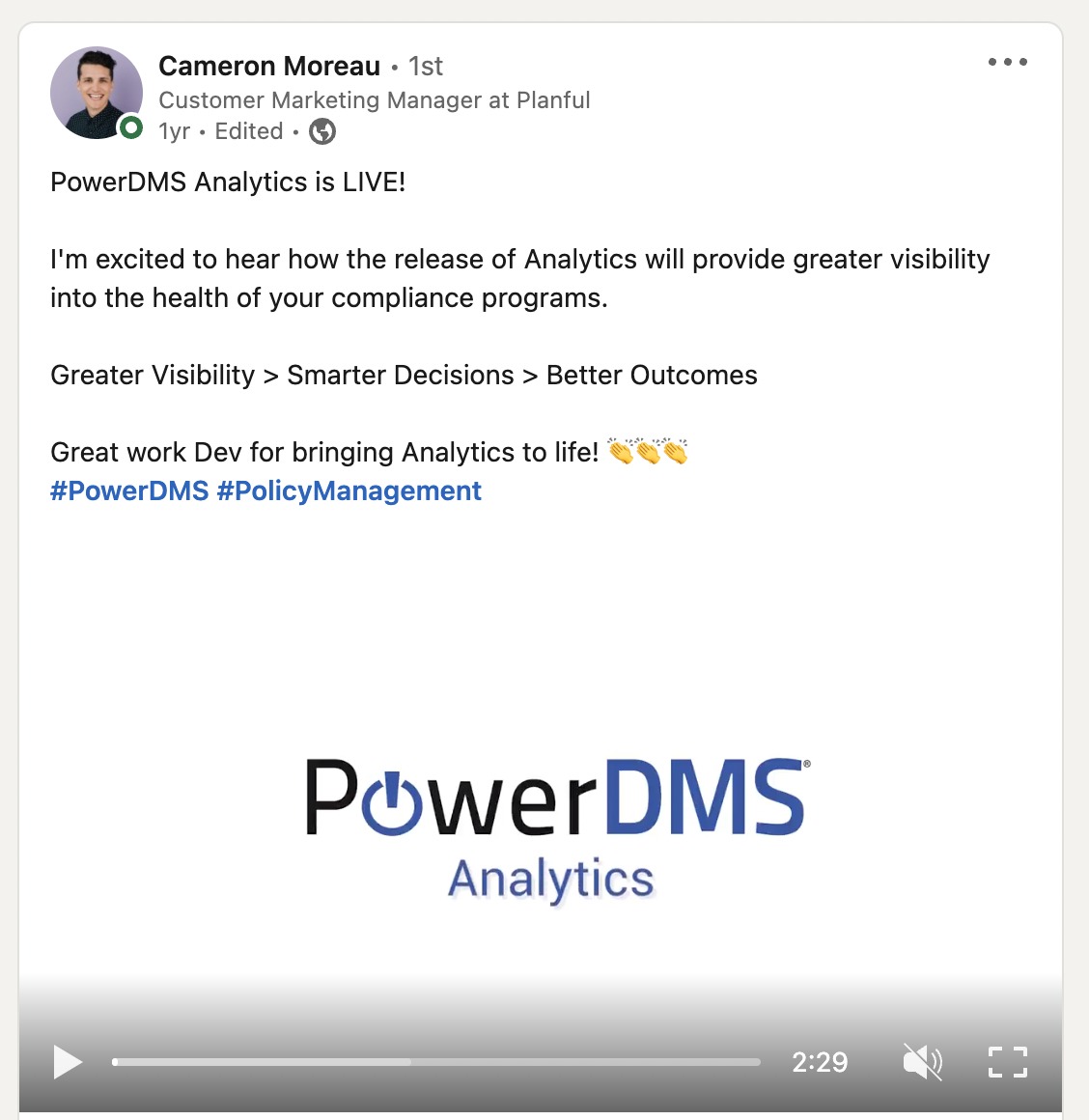
In the News
The release was features in CRWire and also got several positive comments on LinkedIn.
Reflections
Learnings
In this project, I was able to design Data Visualizations, which provided me with a good grounding in visual design principles with Data. I also was able to conduct Beta Rollout and user tests to iteratively validate product success
Takeaways
Designing Data Visualizations can be easy or complex, but not all users can grasp complex visualizations. Therefore simple visualizations that users are familiar with is better than complex ones that might visually look appealing.